
Infosys Helix is a healthcare-focused division of Infosys’s larger digital transformation platform. At its core, the division leverages AI-first strategies and client configurability to create seamless experiences that improve the quality of care while reducing costs. Helix has developed a suite of applications directed toward Payers, or health insurance companies, to manage their administration, employee groups, providers, in addition to improving the overall claim process.
Create a bonafide design system modeled from Bootstrap 4 that utilizes the division’s newest branding guidelines.
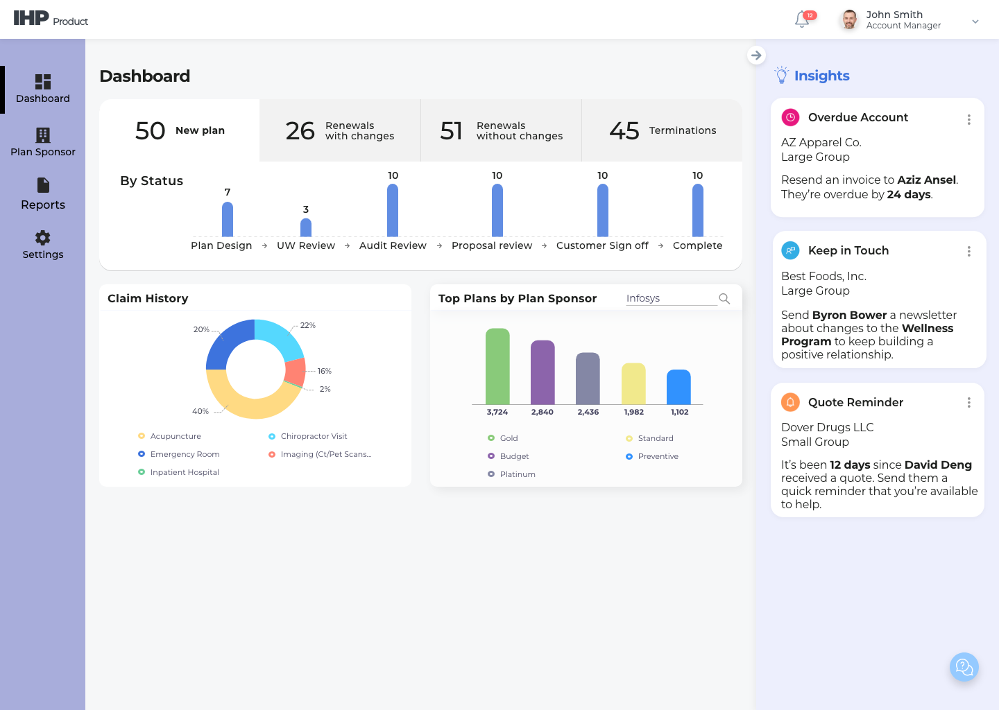
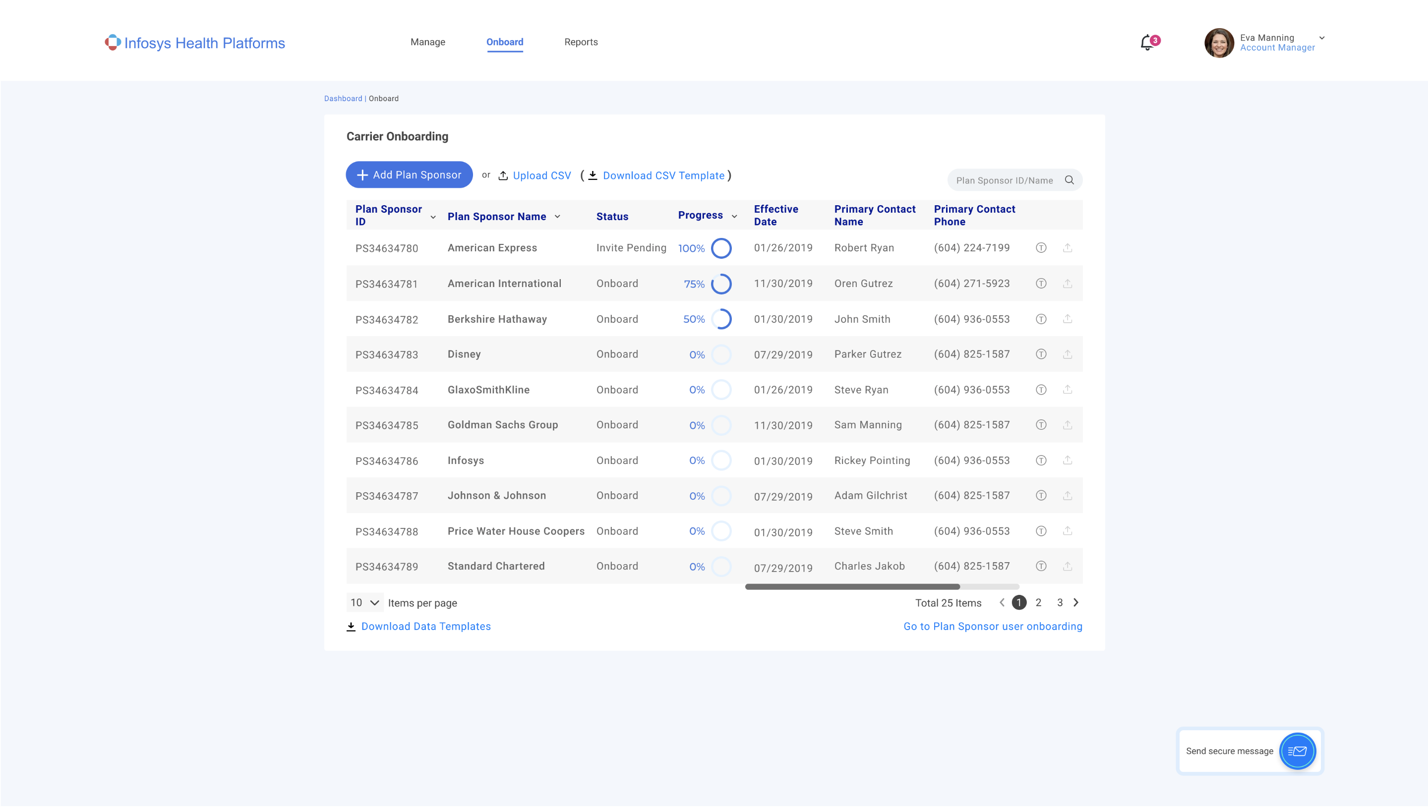
Infosys Helix recently rebranded from IHP (Infosys Health Platform) and needed to correspondingly update its products while rapidly delivering new products to market. These previous iterations of IHP/Helix applications often utilized UI styling more suited to a consumer-facing audience and lacked a cohesive color scheme.
Noticing an inconsistent UI doesn’t take a rocket scientist, nor a UX/UI designer for that matter :D. That said, to create a design system specific to our needs, we took an application-specific approach. This involved an audit of existing and future application requirements, in addition to conversations with stakeholders and the larger design team. We decided on the following:
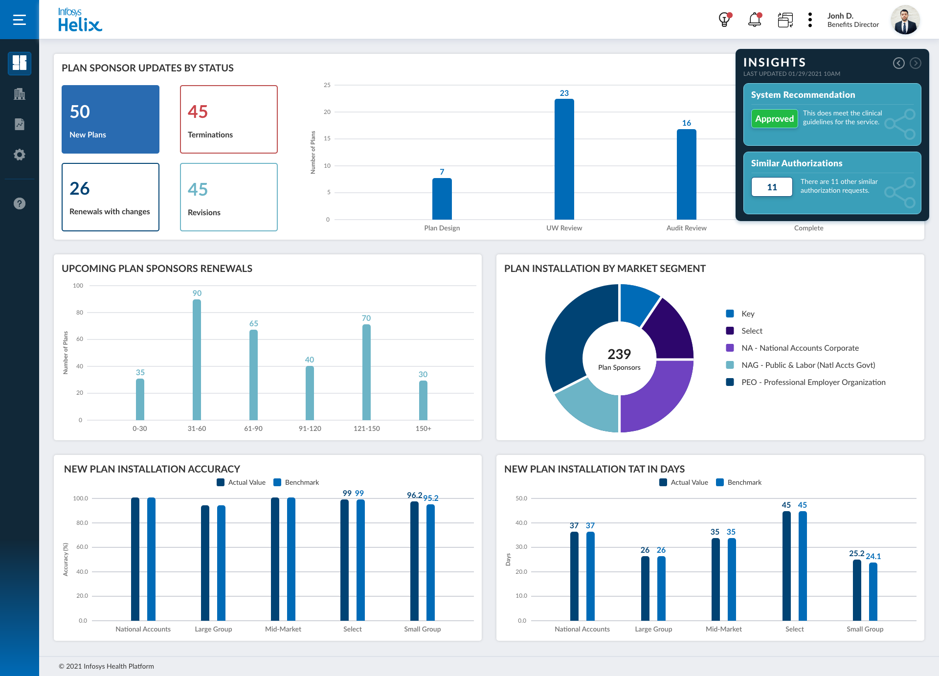
Departing from the previous UIs, we needed to evoke a more modern, clean, and business-oriented design that could flexibly showcase our information-heavy content and analytics across our numerous platforms.
Our software is often workflow-heavy, so we needed to design for clear information hierarchy, organization, and user next-actions.
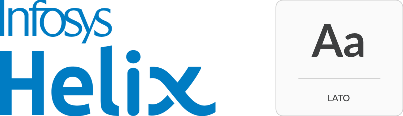


To emphasize our content, the system is predominantly white and grey. Moreover, we utilize Google’s Lato, a modern, yet serious san-serif font to achieve high legibility. Per our new branding, we selected a blue-focused color scheme to achieve our desired professional feel. Overall, we employed color to both subtly break up and organize content, in addition to conveying action or meaning. To this first point, we opted for a dark blue gradient in the left navigation to ground our design.

As soon as we started sharing our revised application suite utilizing our new DS, feedback from both stakeholders and clients has been phenomenal. Across the board, we were able to streamline user flows and improve usability. The redesign of our menu included easy access to system-wide features that enhanced overall functionality. Lastly, the implementation of the design system not only increased design collaboration, but shortened overall product timelines.
Like any good design system, Helix is constantly evolving and we are in a continuous loop of learning and feedback. While we designed our system for flexibility and the addition of new components, we are continuously evaluating how well our design system fits the needs of our products, branding, and vice-versa. Luckily, component-based design and the collaborative nature of XD will make future changes easier to manage as we continue building new and exciting healthcare products for our clients.